Search This Blog

Showing posts with label Cover art progress posts. Show all posts

Thursday, 2 February 2017

Making of the, "Land of Giants," Cover Art.

The latest book, "Land of Giants,"  is finally up and available on Amazon.  I know it has been a long time between drinks when it comes to my novels, but it is worth it, I assure you!

This novel is $2.99US as a Kindle book.  There are 438 pages in the print edition, a very good length of novel, so it is well worth the money.  It is amazing how often I have bought a Kindle book, started reading, and realised that it was more like a short-story length.  Not this one!

As usual for my novels, this book is a story of friendship, love, courage, growth, humour, magic, and of course adventure!   Add in a lot more music, plenty more amazing beasts, and a trip to a new country in that other dimension where Vikings still rule. My first readers tell me it is a very hard book to put down, especially towards the end.    

To do the cover, I really wanted a bit of an action shot, but I didn't want to give away too much of the story either.   I had a couple of ideas at first but soon settled on a scene from early in the book, with Andy and Lem sailing to rescue Lily, Perry and Bu.  

Having decided on the scene I wanted to portray, it was time to do some thumbnails to see if my ideas would work.  My first idea of having Archelon, the giant prehistoric turtle, come up the front side of the boat didn't work because he obscured things too much.


 So I put him behind the boat and started scribbling to see if it could work that way.


Heh, he looks a bit too happy in that one, but I could see that the idea was possible, so I kept drawing.

  
Until I had a design I could work from for the final piece.


So then it was at a stage where I could pull out the watercolour paper and draw it for (hopefully) the last time.


And ink it with indelible ink.

And draw and ink the plush-crested Jay on the back cover.  The Jay makes an appearance in the story a couple of times, and I thought he would be a great addition on the cover.  Don't worry, Bu the cheeky dog is still in the story, but she wasn't on the boat so I couldn't draw her there.    

I'm so sorry, I totally forgot to take stage pics while painting.  Again!  I do get so very involved, I forget. A any rate, here it is, all done.

 
Then it was time to scan the final art and decide how to crop the page for best effect with the text. After that I added in the titles and the blurb on the back, which went really smoothly this time around.  Yay!


What do you think?  Does it make you want to read the book?  I hope so!  It's a stand-alone story so you can certainly read it without having read, "Land of Fire," first, but you very well might want to go back and read the first book when you finish this one.  :D


Wednesday, 20 January 2016

The Making of the Cover Art For "Freya and the Hairy Goddess."

I'm writing and posting this on Thursday because my computer has been behaving a bit oddly and I don't want to miss posting tomorrow.

Starting tomorrow for four days, Freya and the Golden Bear, the first book of this series, will be free for kindle from Amazon.  Go for it!  Have a read!  What have you got to lose?  It's a wild adventure full of interesting friends and foes, and should make you laugh too.  I certainly wrote it to be light and funny, and by all accounts it hits the spot.  


The second book of the series, Freya and the Hairy Goddess, is now available on Amazon as well.  My first readers tell me it's as if the first book never ended, except that the two stories do stand alone.  I'm not a big fan of cliffhanger novels, I'd rather give you your money's worth with each book.  So, if you enjoy the first one you've got for free, which I'm sure you will, do buy the second one too.  :)       

I was a good little artist this time and remembered to do some progress shots for the art work, so here goes.  There were a few pages of sketches done first.

Some were me working out how I wanted the cover to work.  The first idea wasn't quite right.  Too much of the giant vulture went onto the spine and back cover.  I tried some very different ones but kept coming back to the snow vulture.  I'd had that image in my mind for ages and knew it could work, I just needed to change the way the three figures interacted with each other and the required cover format.  

So I kept sketching.
 
Until I hit on the right one.  See the bottom left drawing?  Oh yeah, that was it!

So it got played with some more. Note the studies of vulture feet down the right hand side.  :)


And I spent some more time getting Freya and Dinna just right.


And then it was time to go for the actual canvas, already base-painted with blue, and to draw it one more time.  Actually it was drawn twice more, because I decided my backing blue was too dark, and I got the positioning of the figures a bit wrong, so I over-painted the backing again and redrew it.  
 
 
Then I began to line in some colour. I was aiming for most of the scene to be in blues and whites to let the main features really stand out and yet allow the text to be easily visible, so I needed the white feathers to be outlined in a slightly darker blue to bring them out of the white and blue background just enough to show up.


So, then it was time to block in some white. 
 

I'd drawn a kind of topknot on the vulture but decided it looked too much like angry Bigbird, so I changed it into a full ruff type thing around the head, which looks way cooler.

I also had the neck bare of feathers, and therefore pink, at one stage, but it looked hideously... well... the best word to use here is probably,"phallic," so that had to go too!  :D  

And so I just kept fiddling and layering till I had it how I wanted it. I was deep into art space by then and forgot to take more photos as I went!  Whoops!   


After that it was kindly photographed by Andrew and it was time to open Gimp to get the cover finalised.  What do you think?  I wanted Freya and Dinna's bravery and teamwork to stand out on the cover.  I hope they do, and I hope it encourages you to want to read the book.  It was so much fun to write, and I'm sure you'll find it so if you read it.  :D


Sunday, 13 September 2015

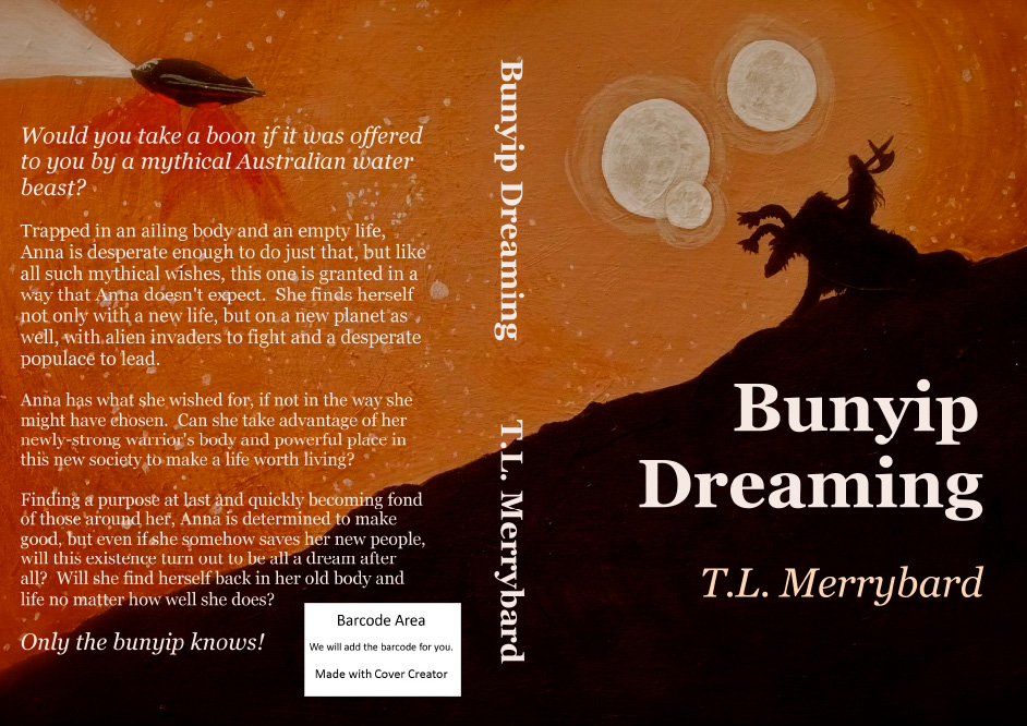
The making of the art for Bunyip Dreaming's cover

I don't usually do two book postings a row, but I said I'd post this one today, so I will. :)

I wanted to do something for this cover that didn't reveal too much, yet I wanted it to be alien, and to have a feeling of freedom and strength about it.  I think I managed that.

Since I'm getting better at Gimp, I wanted to make the cover all in one so that it tied together well from the front to the back of the book via the spine.  I achieved that too!  Very pleasing!

So, anyway, back to the beginning.  I began with a pretty firm idea in my head but needed to refine it, so I got the good old sketchbook out.  You can see my twiddling much more clearly if you click on the pic to embiggen it.  
 

I forgot to take a photo of my drawing onto the painting board.  I'll get better at remembering, I promise.  :) The next stage I remembered to photograph was where I'd blocked in the colour.  I used acrylic paint on masonite for this one.

This board was an overpainted old one.  At times you can see the textures of the underneath paint showing through as the light hits them.  It came out ok in the end, though at times during the process I was worried it might detract from the final work.  I've got to get some new boards!

Next stage was just adding detail. It was by no means a complicated project. My main issue was making the night sky look night-skyish without making it too speckled for the words that had to go over the top of it.  I wasn't sure how bright or blotchy to make the moons either.     


Blinder added. You'll have to read the book to find out what a blinder is, or a broofer or a Tarintarn!  There's one of each on the cover.  :)


So, it was finished or at least finished in the painting stage. I planned to fiddle a lot once I got it onto the computer.  It's a heck of a lot easier to experiment there than with the original! 

Andyroo took it out and took high quality photos of it at this stage.  It's interesting how much the colour changes from the photos I took inside. This is much closer to how I described the night in the book.

 
But I wanted it more orange and zippy, and a bit darker to bring the lettering out, so I fiddled and managed to get it to this in iphoto using mostly the boost effect, of all things.  It's amazing what you can do with those little buttons!

 
And so to Gimp, and I'm getting better and better with Gimp.  The final cover only took me a few hours and there was no strangled crying involved at all!


I hope it makes you want to read the book!


Thursday, 9 July 2015

Making of the Cover Art for Dog Slobber!

Hmm, not sure I can call it art as such.  More cartoons really.

The front cover image didn't get too much working out before I went for the final event.  Actually at the time I drew it, it was going to be one of the inside illustrations, but I couldn't go past it for the cover once I'd done it.

Here's the sketchbook page where I messed with ideas.  If you click on it you can see it much better.


I didn't think to do progress shots but here is the scan of the image once painted.  I ended up having to photograph the images used both inside and outside the book (with Andyroo's help) because our scanner has gone weird and was kind of flaring out areas, as you can see here.


Here's the back page.  I remembered to take more progress shots of this one.  Here's the sketchbook page.  Once again it looks much clearer when embiggened!


You can see I was working with ways to pose the dog and person so that they fit the page nicely beside the text, and you also always have to factor in the barcode box which generally goes on the bottom right of the back page.

Once I'd decided which composition I liked, I redrew it in my watercolour pad.

Then did it in ink with my trusty old permanent pigment ink fineliner.


And finally the watercolours.  Sorry, I forgot to take progress shots here, just went for it!

So there you have it, two images, some work (and a little swearing) with Gimp, and my new cover was ready!  I love it, especially the cheery colours.  I hope the young readers do too!  


I've had a good time with my writing this week.  Been having a blast editing Bunyip Dreaming, and enjoyed it so much I kept doing more of it, so am almost ready to send it to my first readers.  Woooo hooooo!!!  Not long to a new book now, peoples!

Today I had lunch with my sis, Jen, while we nutted out some ideas I have had for my next book, which is a sequel to Cunning Plans.  She's horsier than me these days so I wanted to make sure I wasn't getting too farfetched with my ideas.  It will be another mystery, set in the horse world like Cunning Plans, to be provisionally called Heroic Plans.  Jen could totally be a novelist as well, if she wasn't so busy being a mum, IT guru, and horse nut!  It was a lot of fun and we got plenty of good stuff worked out for the book.  I'm very lucky to have her for a resource for idea-bouncing.  Andrew too.

May you have encouraging, kind, creative-collaboraters and supporters of all kinds about you!  It's what we all need.  Avoid the critics and seek out the supporters.  We all have quite enough critics in our own heads. 

And for a little giggle, the face recognition thingy in my photo programme decided this bit of a pic of Ferry from the book was a face and made a separate image that I found when searching for the pics for this post.  Too funny!


Thursday, 16 April 2015

The birth of the Cover Art for Cunning Plans

The Kindle version of this book has a perfectly nice painting on it, one I did for a lady who did me a favour many years ago.  This is Ruby.

 I shortened her long star in Gimp to make it match Lingo, the horse from the story, better.


Trouble is, this horse was a chestnut, yes, but also a little Standardbred mare, and every time I look at her, I know she isn't a tall Thoroughbred gelding. So, a new cover for the print version had to be made!

Since there are no chestnut Thoroughbreds in my life to use as models, I began with a mix of photos searched off Google. I can't show them here because it wouldn't be fair to the owners.  I worked from them all so that there is not a particular recogniseable image to cause copyright problems.

I knew exactly what I wanted to do composition wise and since I was using acrylic on canvas, I had a lot of wiggle room for fixing issues that cropped up, so rather than doing lots of sketches, I just drew right onto the canvas and got down to it.

The original drawing was done in white pencil on a gold and brown background.  I then painted over the drawing with dark blue and filled in the spaces with red, because the gold was shiny and making it hard to see what was going on!  The brown and gold were just left-over paint that I had brushed onto the canvas years ago, rather than waste it. I won't do that with gold again!  :)  You can see it showing up around the lines, and even in the finished work it is still here and there a little. 


I drew back over that with white pencil again to fix things that showed up when I could see it better, and to add a little more detail.


Next stage, adding in blocks of colour.  


More colour and lots more work on the horse. I had an idea that Kat might use green on Lingo to celebrate her Irish blood, and also that it would really zing against the complementary oranges and reds.  I was happy with how Lingo was going, but I really wasn't happy with the rider. 


I slept on it (and painted it in my dreams half the night) and in the morning I got up and overdrew it with white pencil again.  The lower leg was too long (for an ex-jockey's!) and tipped too far back.  The angle of her face was wrong and head/helmet was too small. 

          
I was happier with that all fixed, but the green saddle-cloth was just TOO zingy and detracting from the rest of the image, so I took it back to dark blue like her coat.  Better!  


  But I still didn't like it so I took it back to a numnah-shape.


And so, a few last touches here and there, and all finished!  I thought a dark blue/purple to match Kat's riding coat would work well for the title and author text areas, which will go above and below on the red/orange.  A bit of a close up of the finished figures. What do you think?


I'm very out of practice working with acrylics, but I think it came out ok!

Friday, 27 February 2015

Birth of the Cover Art for my soon to be published book, Chicken Soup for Satan

Well, this has been a bit of a production!  I've drawn an awful lot of German Shepherds getting ready for the final piece.  Not that that was a hardship, as I think they have beautiful heads, and every subject you draw and paint teaches you new things, especially if you tackle it more than once.

It began with pages like this of thumbnails.  I've posted this one before but, eh, it is the beginning of the journey, so it needs to go here too.
  
Next I drew bigger images, sorting out how to fit the dog and bowl on the page, keeping in mind that the book format is skinnier than my paper.  I needed room for the title and author text, and I also practiced drawing the doggy character from the book, Ghost, in more detail. Once I settled on a composition, I did my final drawing.


 That image had to be darkened a lot in iphoto.  I drew very lightly.

After that I put in my first washes on the background.  The paper I was using didn't hold up very well to washing.  It's only a pad of water colour paper.  Not the best quality.  Still, it was a start I could work with.


More washes followed.
I kind of like this stage.  Spooky! Fits the theme of the book, but Ghost is not one of the spooky things in it, so on I went.


At this stage I began to work in more detail.
Aww, the character of of Ghost was coming out very nicely by now!  Pupils and some other little detailed touches still needed to be done, and I was worried about the paper being over-worked, so I got out the Aquarelles for the last few bits.

After that Andyroo kindly helped me photograph the image, and then I resized it to fit the book cover ready to add text in Gimp.

What do you think?

I got a splash of hot magenta on his forehead right back at the start and it didn't quite wash out properly, but luckily I can fix that in Gimp.  Bless you Gimp!

For the back cover, I just couldn't think of any image to use that wouldn't give too much away, or give the wrong impression about the book, so I have just washed a full page to match the texture of the background in the front cover.  I'm trying to do a different spine colour for each book, just for fun, and this one is obviously going to be purple!  :) 

There are many, many artists in the world who would do a much better job of this sort of art than me.  I would consider myself a novelist first and foremost, but I do enjoy the challenge of doing my own cover art, and I hope you enjoy seeing them in progress!

Final editing is part way done, and soon the book will be available.  Exciting! This is the first book I have finished in many years, since before I got sick with Lyme disease more than a decade ago. To be returning to my creative life means more than this bard can express in words.