I wanted to do something for this cover that didn't reveal too much, yet I wanted it to be alien, and to have a feeling of freedom and strength about it. I think I managed that.
Since I'm getting better at Gimp, I wanted to make the cover all in one so that it tied together well from the front to the back of the book via the spine. I achieved that too! Very pleasing!
So, anyway, back to the beginning. I began with a pretty firm idea in my head but needed to refine it, so I got the good old sketchbook out. You can see my twiddling much more clearly if you click on the pic to embiggen it.

I forgot to take a photo of my drawing onto the painting board. I'll get better at remembering, I promise. :) The next stage I remembered to photograph was where I'd blocked in the colour. I used acrylic paint on masonite for this one.

Next stage was just adding detail. It was by no means a complicated project. My main issue was making the night sky look night-skyish without making it too speckled for the words that had to go over the top of it. I wasn't sure how bright or blotchy to make the moons either.

Blinder added. You'll have to read the book to find out what a blinder is, or a broofer or a Tarintarn! There's one of each on the cover. :)

So, it was finished or at least finished in the painting stage. I planned to fiddle a lot once I got it onto the computer. It's a heck of a lot easier to experiment there than with the original!
Andyroo took it out and took high quality photos of it at this stage. It's interesting how much the colour changes from the photos I took inside. This is much closer to how I described the night in the book.

But I wanted it more orange and zippy, and a bit darker to bring the lettering out, so I fiddled and managed to get it to this in iphoto using mostly the boost effect, of all things. It's amazing what you can do with those little buttons!

And so to Gimp, and I'm getting better and better with Gimp. The final cover only took me a few hours and there was no strangled crying involved at all!
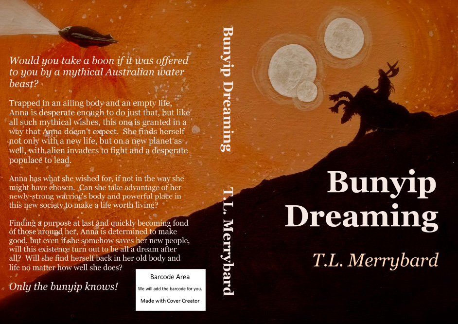
I hope it makes you want to read the book!
No comments:
Post a Comment
I would love to read your comment, so please do!